Designers reveal the top residential and commercial spaces they’re telling their clients to invest in for rest and relaxation
Sherwin-Williams asked more than 250 designers about the spaces they’re counseling their clients to invest in for rest and relaxation, the hues that encourage productivity within a space and the power of color to enhance hybrid working environments. For more information about these results, images or commentary, reach out to Sherwin-Williams@clynch.com.
When asked to share one piece of advice for using color to enhance a multipurpose commercial space to promote calm, rest and relaxation, an overwhelming amount of designers shared this word: harmonious.
This is one of many ideas that was top of mind for Sue Wadden, director of color marketing at Sherwin-Williams, as she and her Global Forecast Team developed the Sherwin-Williams 2023 Commercial Colormix Forecast and from it, chose the highly anticipated Sherwin-Williams 2023 Color of the Year, Redend Point SW 9081. “We’re trying to make areas in our home more work-centric—but on the other hand, when we’re in an office environment, it’s important to incorporate elements that make it feel more like home,” she says. “We’re holding onto what was great about working from home and looking to find a balance.”
In fact, when it comes to the home, designers say bedrooms (94 percent) and living rooms (79 percent) are the top two spaces they’re counseling their clients to invest their design dollars in for rest and relaxation. For commercial environments, this answer is lounges (86 percent) and break rooms (71 percent).

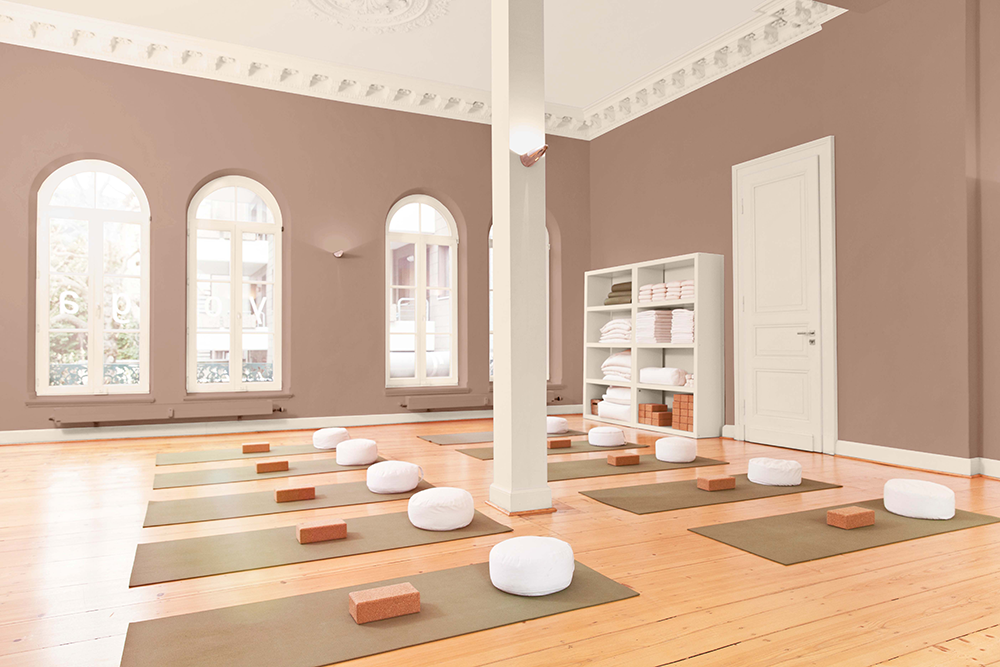
Redend Point SW 9081
As for what Wadden loves most about the Sherwin-Williams 2023 Color of the Year—its versatility, warmth and representation of new beginnings. “I love seeing this warmth again. When we were in the mindset of the gray decade in the 2000s, it was all beige—we didn’t have the balance we do now,” she says. “I could easily see Redend Point SW 9081 in a workspace but also in an eating area. We’ve also shown it painted on a vanity for homeowners, and it would look beautiful applied to a washroom space in a commercial setting, but it also has a place in education too. We’re seeing this warmth now and it’s all about pairing that warmth with blues, greens and grays to create harmony.”