These are the colors homeowners associate most with self-care
Sherwin-Williams surveyed more than 700 homeowners about how and where they’re using color to achieve self-care at home. For more information about these results, images or commentary, reach out to Sherwin-Williams@clynch.com.
The art and evolution of self-care
From journaling to yoga to skin care, the art of self-care is more prevalent now than ever. The home has become integral to these rituals, which begs the question: how can consumers enhance their spaces to improve their well-being?
Cultivating calming and restorative home environments can enhance these practices by giving the literal and figurative space to be more intentional about caring for ourselves and our loved ones, says Sue Wadden, director of color marketing at Sherwin-Williams. “The right colors in our homes invite compassion and reflection. Curating serenity in key spaces throughout the home gives us the energy and peace needed to pursue new horizons and prioritize connection,” she says.
As we reflect on historical associations between color and well-being, Wadden suggests looking at the early 2000s, when soothing hues were first influenced by “spa colors,” meaning coastal blues and greens. This historical context explains why these cool hues continue to be popular, with 60 percent of homeowners naming blue and green as the color family they most associate with health and well-being.

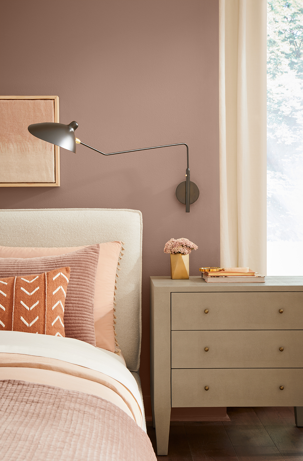
Redend Point SW 9081

Redend Point SW 9081
From the spa to the Earth
Wadden and her team predict this will soon change as consumers think about well-being through a warmer lens, bringing more peace into their lives to embrace a fresh perspective on what serenity looks like in the home. In fact, more than two-thirds (67 percent) of homeowners say they’ve incorporated a new color into their home within the past 12 months to make it feel more serene.
It’s not just these “spa colors” they’re choosing; warm clays and earthy neutrals are also having their moment. “Those popular cool undertones are really starting to swing in the other direction, but the association is still calmness and serenity,” Wadden says. “We’re taking that traditional idea of what soothing hues are and warming them up. Think desert retreats, meditative hikes and handmade clays.”
Designing with the Sherwin-Williams 2023 Color of the Year
So what’s the key to incorporating these trending warm colors into a space? Lean into grounded tones inspired by the Earth, Wadden suggests. “Our Sherwin-Williams 2023 Color of the Year, Redend Point SW 9081, is the perfect example of this idea. This blushing neutral is heartening and slightly feminine without overpowering a space, providing a pleasing background to any room,” she says.
The added beauty of warm and earthy tones is their versatility. According to the survey, homeowners are focusing on bedrooms (44 percent), living/family rooms (40 percent) and bathrooms (35 percent) as they incorporate color into their homes to make them feel more serene. These rooms are all made for relaxation, self care and community, each of which lends itself to these tones in different ways.

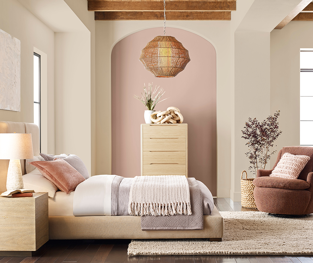
Colors: Redend Point SW 9081, Kestrel White SW 7516
To make a blush-beige like Redend Point SW 9081 work as a focal point in a gender-neutral space like a bedroom or family room, think of the space in different strata, Wadden recommends. “We need balance to make a space feel grounded and restorative. Layer in texture with that color, one step at a time. Focus on creating layers of creamy softness with your bedding or sofa. For example, start with a neutral, smooth fabric and add in a throw blanket and textured embroidery on your accent pillows. Finish it off with natural wood tone furniture and greenery and you’ll immediately feel the richness of the space.”