Get the look: Midcentury modern
In a recent survey, 60% of residential and commercial designers indicated that midcentury modern design will have the biggest impact on design trends in 2022.* To get the look, we surveyed top designers for their tips on how to incorporate this enduring trend into the home. For more images or commentary from interior designers, reach out to Sherwin-Williams@clynch.com.
Laura Umansky, Laura U Design Collective
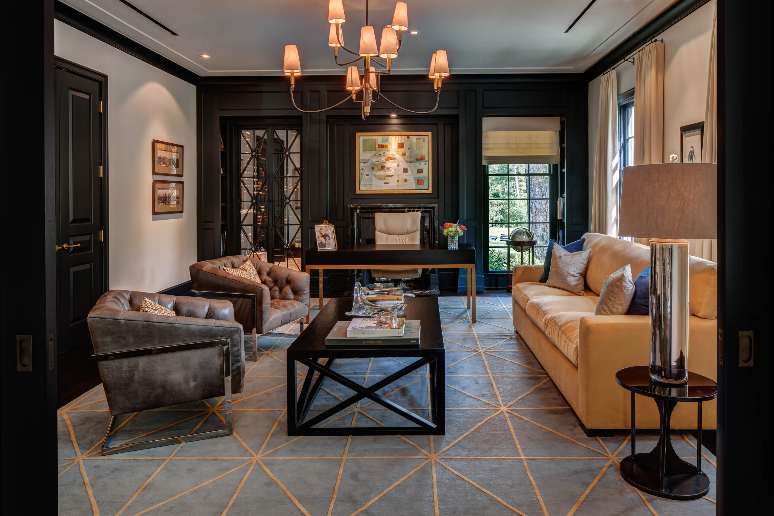
“When I see a deep, burnt yellow hue, it screams midcentury modern. We incorporate this color into our midcentury designs in the textiles we choose for furnishings and soft goods. For paint, Sherwin-Williams Bakelite Gold SW 6368 and Trinket SW 6685 are great options for this color.
When we are designing midcentury modern spaces, we like to start with a traditional neutral hue as a base color, like Inkwell SW 6992. This allows you to add in vibrant midcentury hues with soft goods, like throw pillows or upholstered furniture.”

Photography: Alan Blakely Photography Design: Laura U Design Collective Color: Inkwell SW 6992

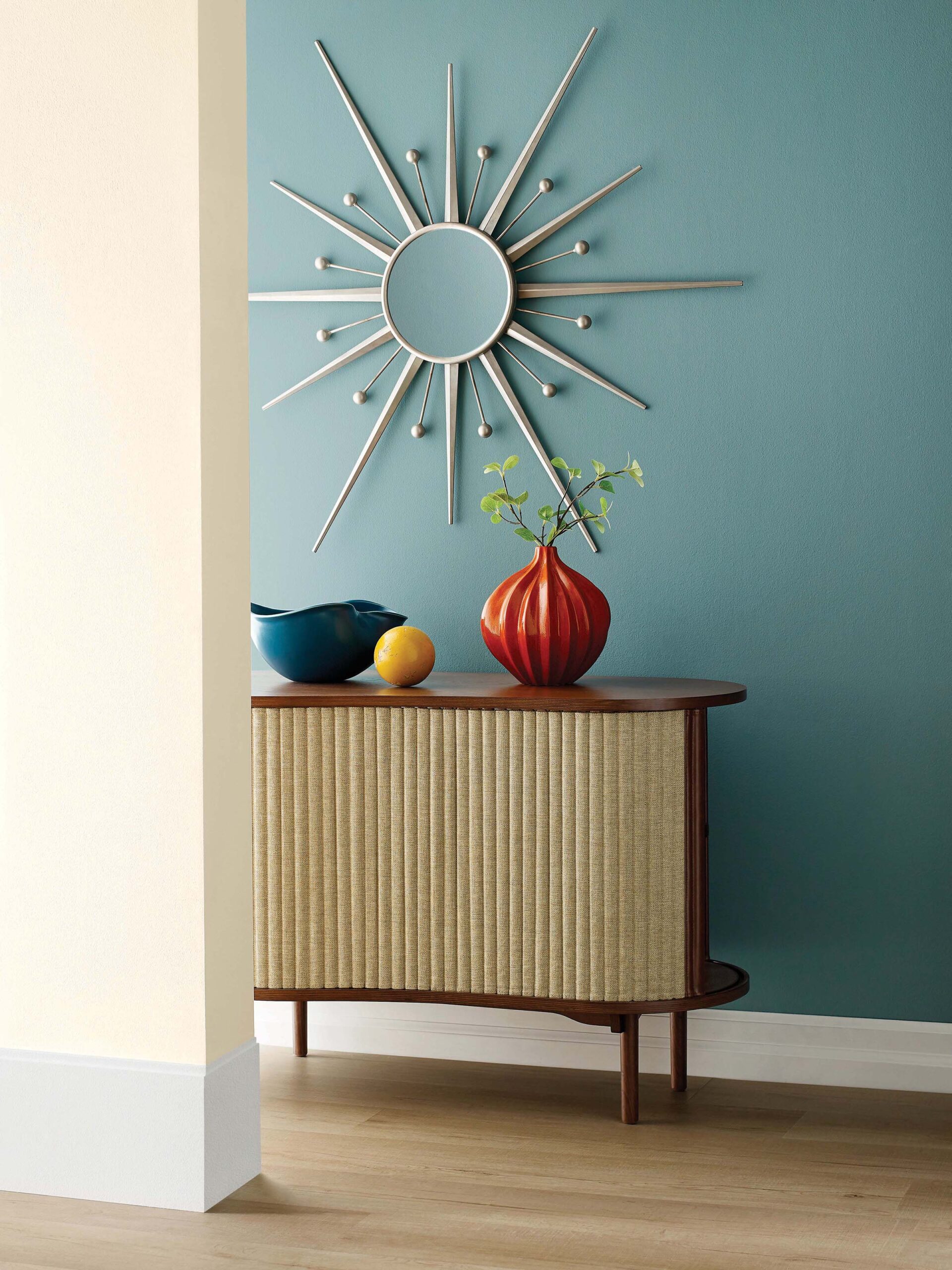
Photography: Sherwin-Williams Color: Moody Blue SW 6221
Sue Wadden, director of color marketing at Sherwin-Williams
“Midcentury modern, to me, is orange and teal. There was a lot of innovation in the 50s and we were able to get turquoise pigments in paint for the first time. While you may think of the 50s as turquoise and chrome, the design evolved in the 60s to become the cool, clean look we think of today. Modern takes on these hues, like Moody Blue SW 6221 and Sierra Redwood SW 7598 from the Ephemera palette of our 2022 Colormix Forecast, really embody that time period.
To incorporate the midcentury look into your own home, take cues from the silhouettes of the time and try to find that in modern pieces or while thrift shopping. The great thing about midcentury modern design is that it really goes with everything. If you currently have a minimalist style, a few midcentury-inspired pieces will infuse a lot of color into your space without overwhelming it. It’s all about finding accessories and using colors that feel sleek, not fancy or fussy.”

Photography: Sherwin-Williams Color: Moody Blue SW 6221
John McClain, John McClain Design
“The key to creating a visually interesting, midcentury-inspired space is to utilize juxtaposition between colors, forms, materials and textures. In addition, remember that nature is at the core of this beloved design style.
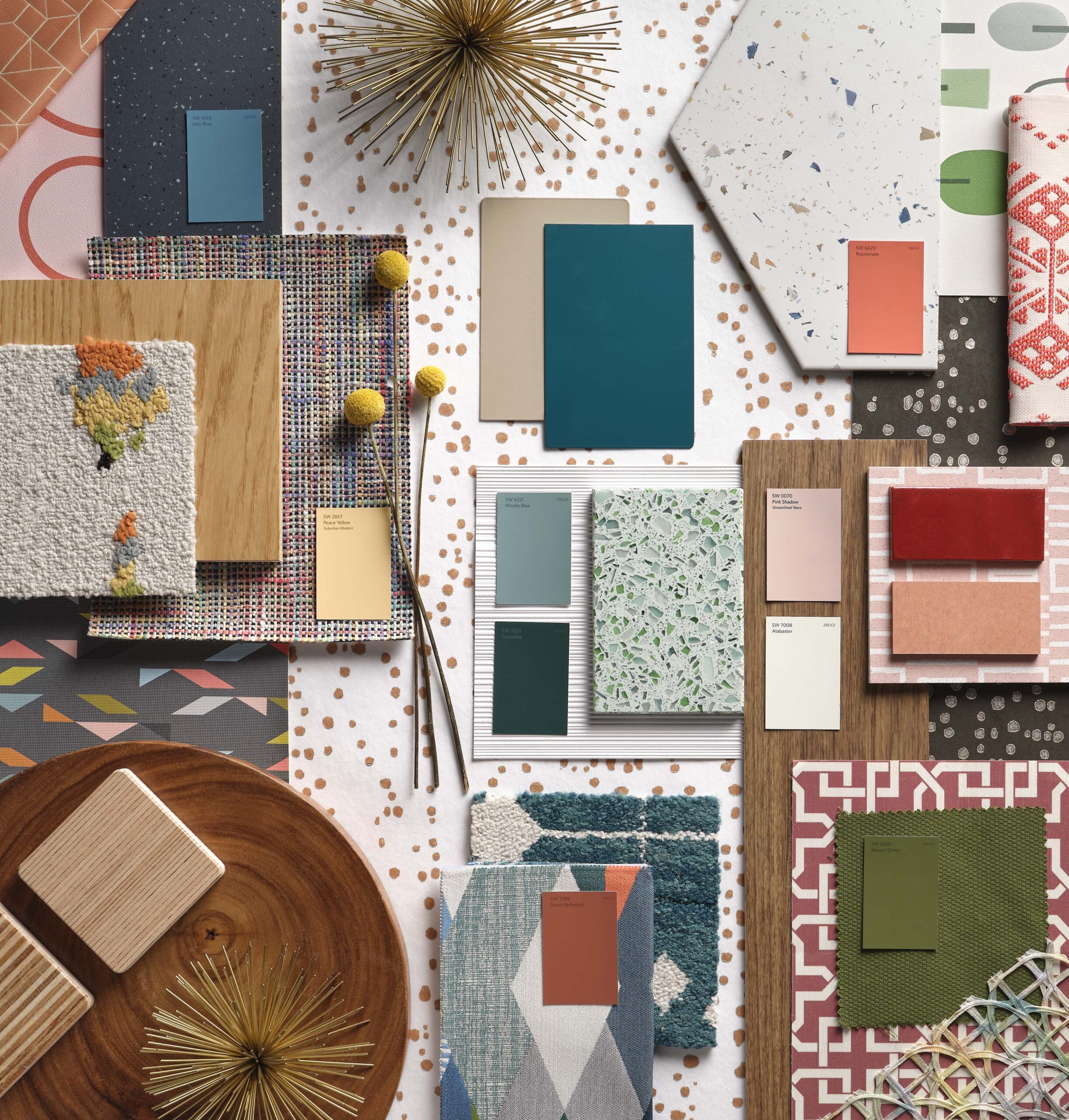
When deciding on colors, a neutral palette should always be the base. Whites, creams, blacks and tans are a great starting point. From there, bring in color snaps through the use of vibrant earth tones such as clay, mustard, ochre, earthy browns, citrons, teals, aquas and forest greens. The one color that defines midcentury modern design is teal. Try Silken Peacock SW 9059.”

Photography: Sherwin-Williams
*Sherwin-Williams 2021 Designer Panel Survey of over 400 professional designers, July 2021